Designed for the people
Riverside Park
A brand built to move.
Client: The City of Rexburg
Riverside Park
Brand System
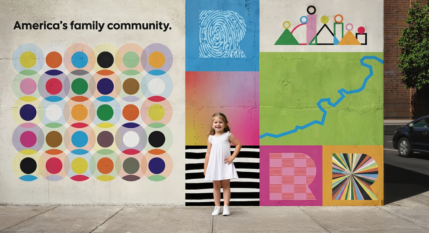
A brand built to move.
Riverside Park needed more than a logo, it needed a system that could hold an entire community's worth of ways to belong. As a multi-venue destination spanning ice, water, and action sports, the park's brand had to work across Rapids, Rink, and Ramps without splintering into three unrelated identities.
The challenge: build something flexible enough to flex per venue, disciplined enough to still read as one place, and timeless enough to outlast whatever trend comes next.

Mission
To build a gathering place where every Rexburg resident — regardless of age, ability, or background — can find movement, memory, and joy.
Vision
A park that belongs to the community. Everyone feels they belong and they know they will have a memorable, fun time.
Brand Promise
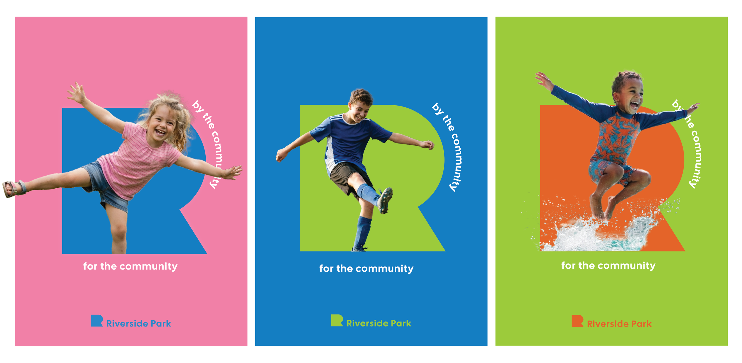
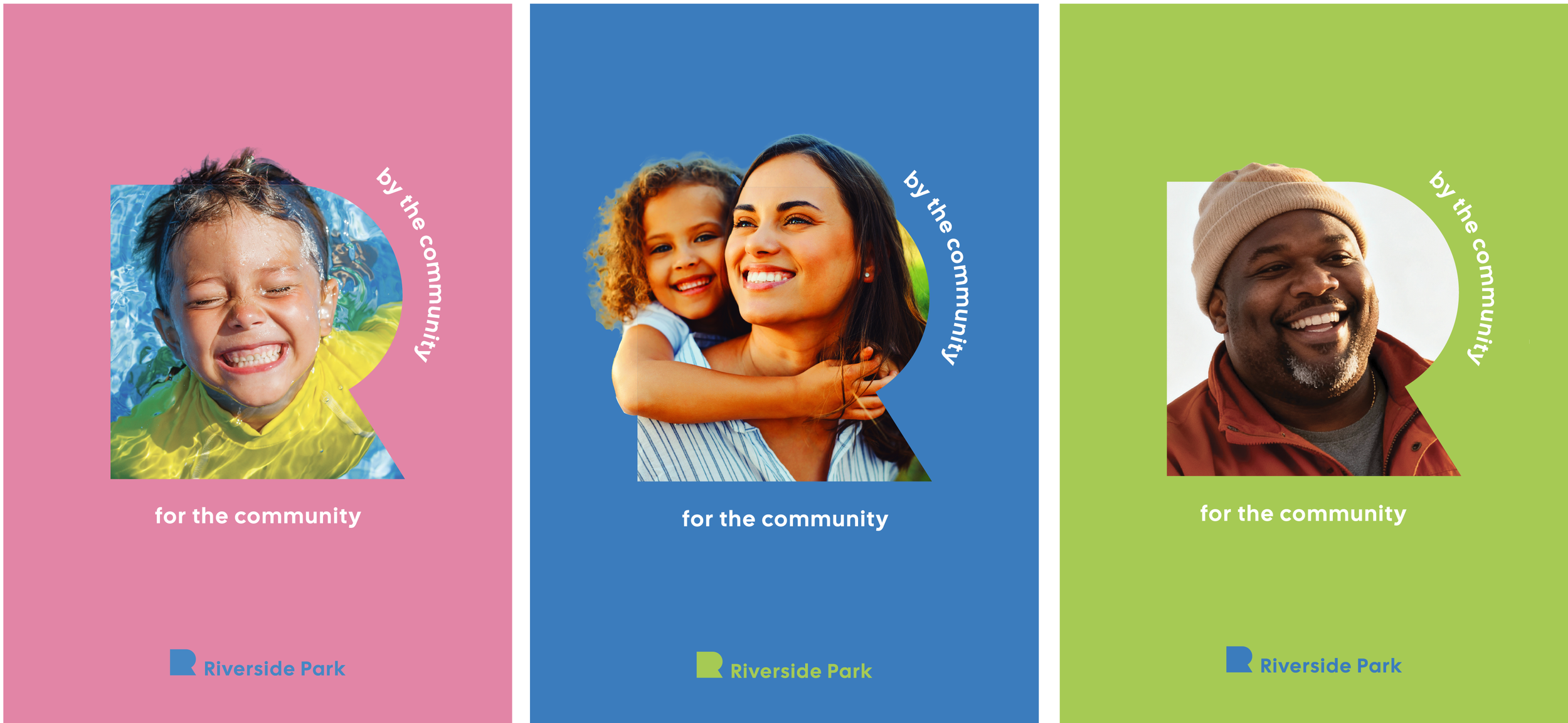
This park was built by your community, for your community. You belong here.
Want to ice-skate? Come ice-skate. Don't want to ice-skate? Come watch.

The mark starts with the city itself. The R is derived from Rexburg's own city logo, a form built around family and inclusion, an emblem that says we don't discriminate; we invite.
That choice of starting point does the strategic work before a single sub-brand mark is even drawn. By deriving the park's identity from the city's, the brand makes a quiet but deliberate claim: this park doesn't exist apart from Rexburg; it's an expression of it. Built by this community, funded by this community, belonging to this community.
The R isn't just a mark. It's a declaration that everyone here already has a stake in this place.
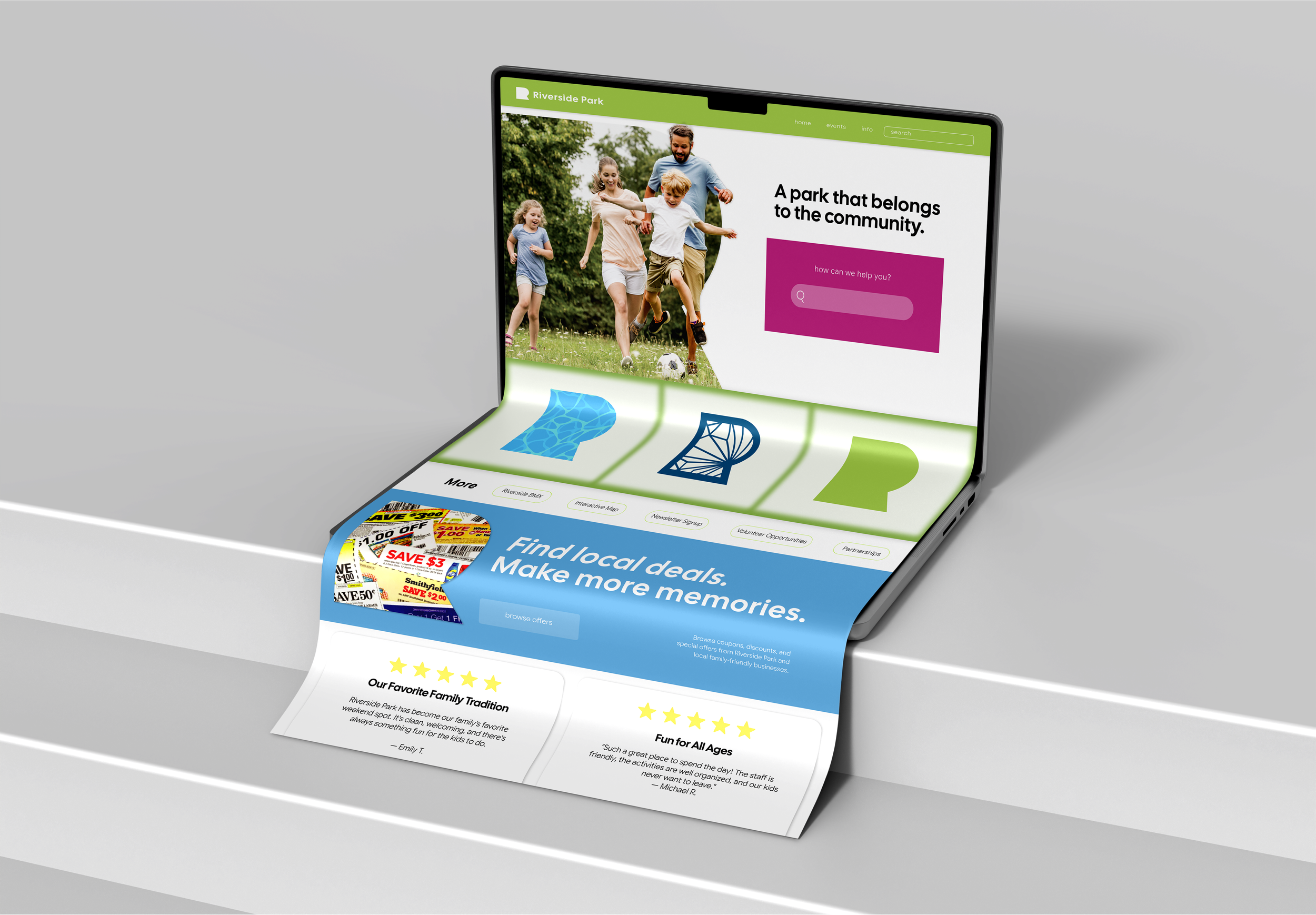
The site is built for three things: function, simplicity, and room to grow. Whether you're booking ice time or checking ramp hours, it should feel effortless now and adapt easily as the park expands.
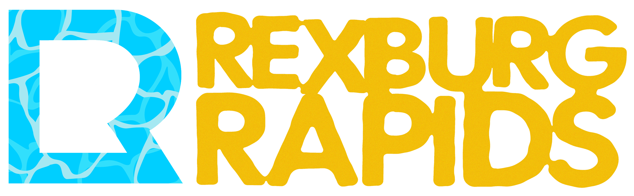
That same flexibility is what shaped the rebrand of Rexburg Rapids.
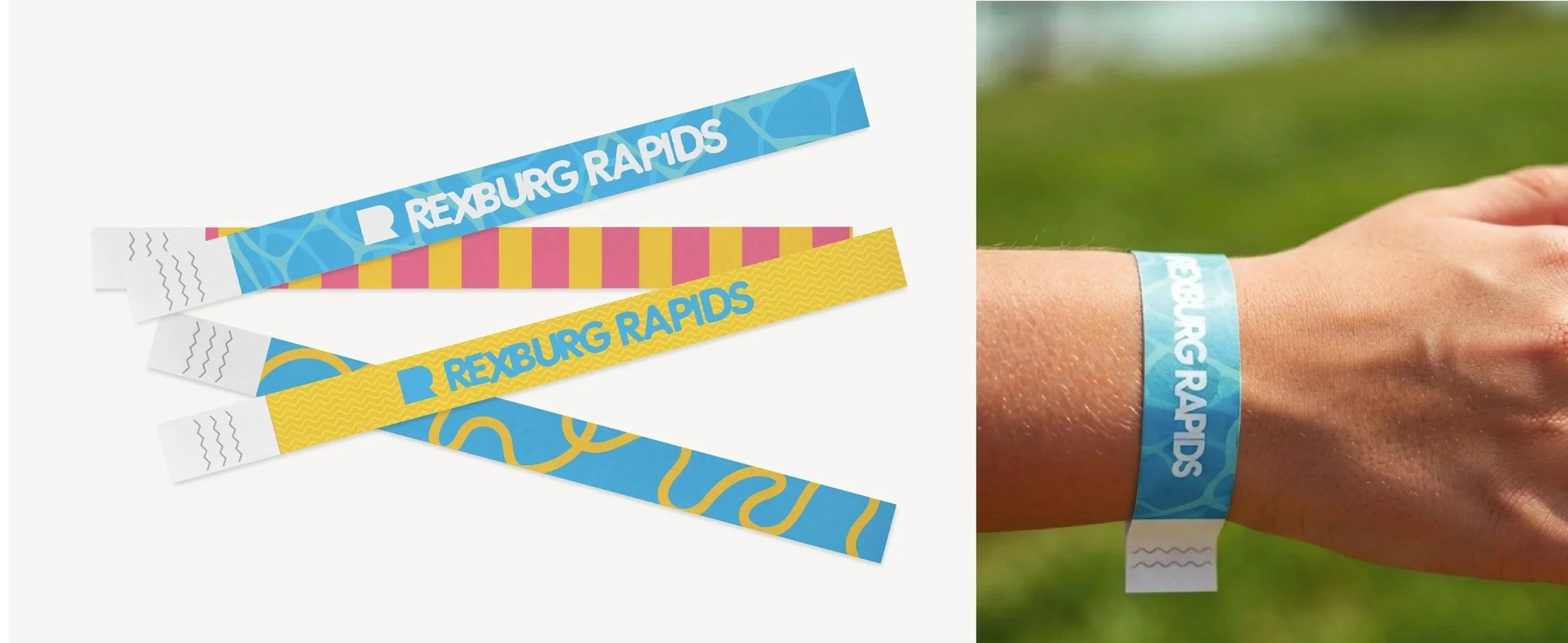
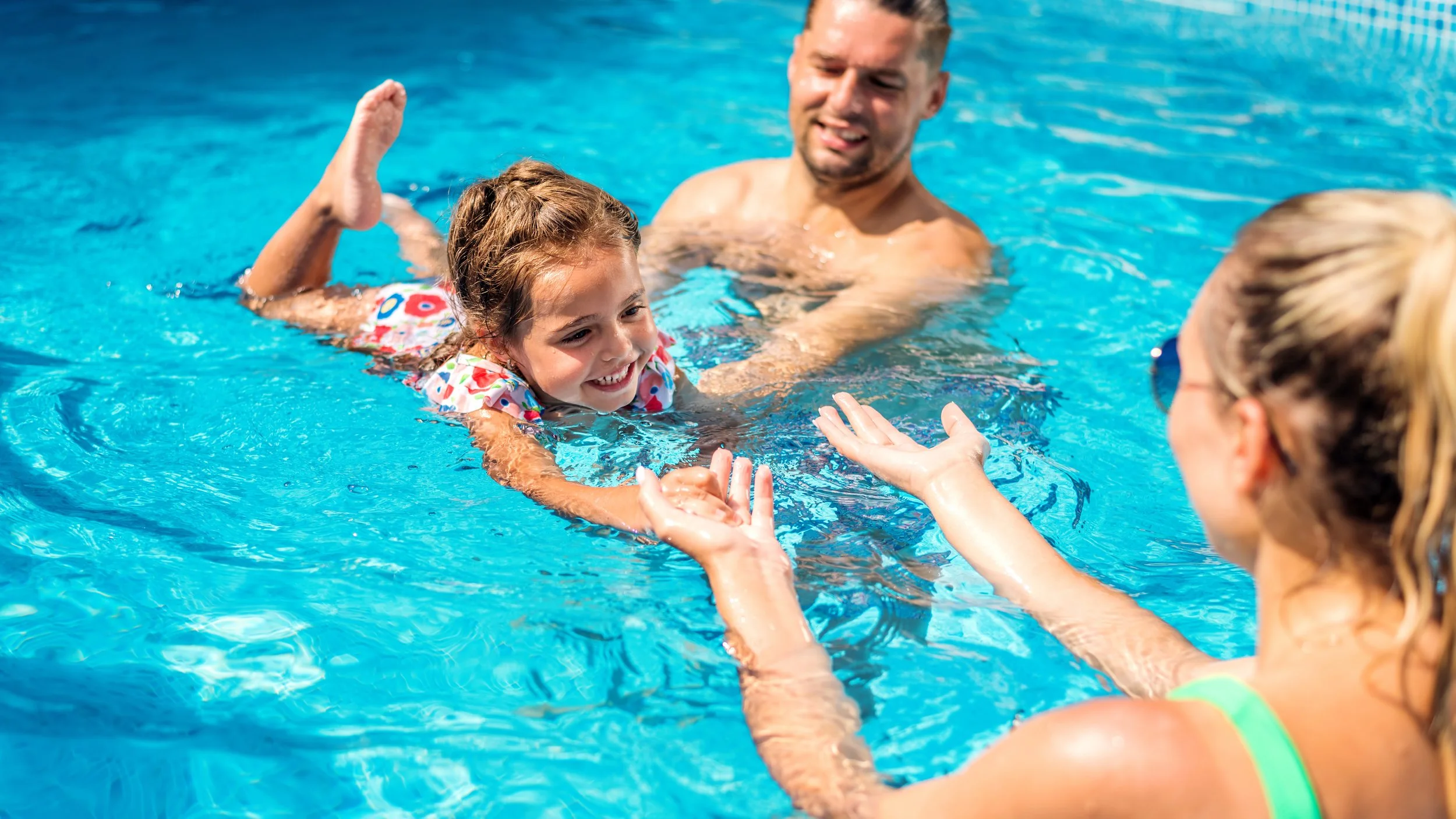
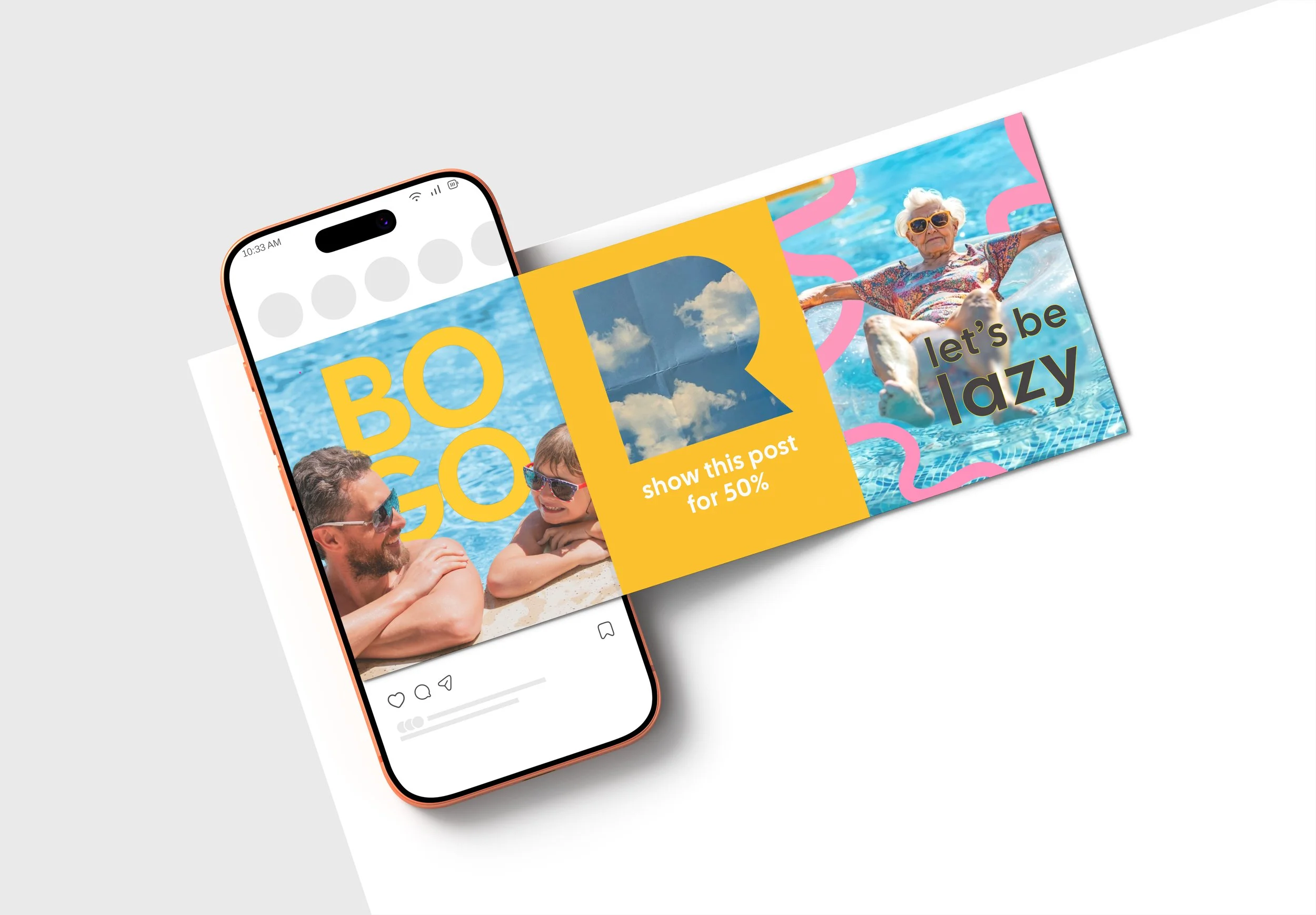
The bright colors and movement continue from print to on the screen. This system allows for freedom, flexibility, and experimentation.
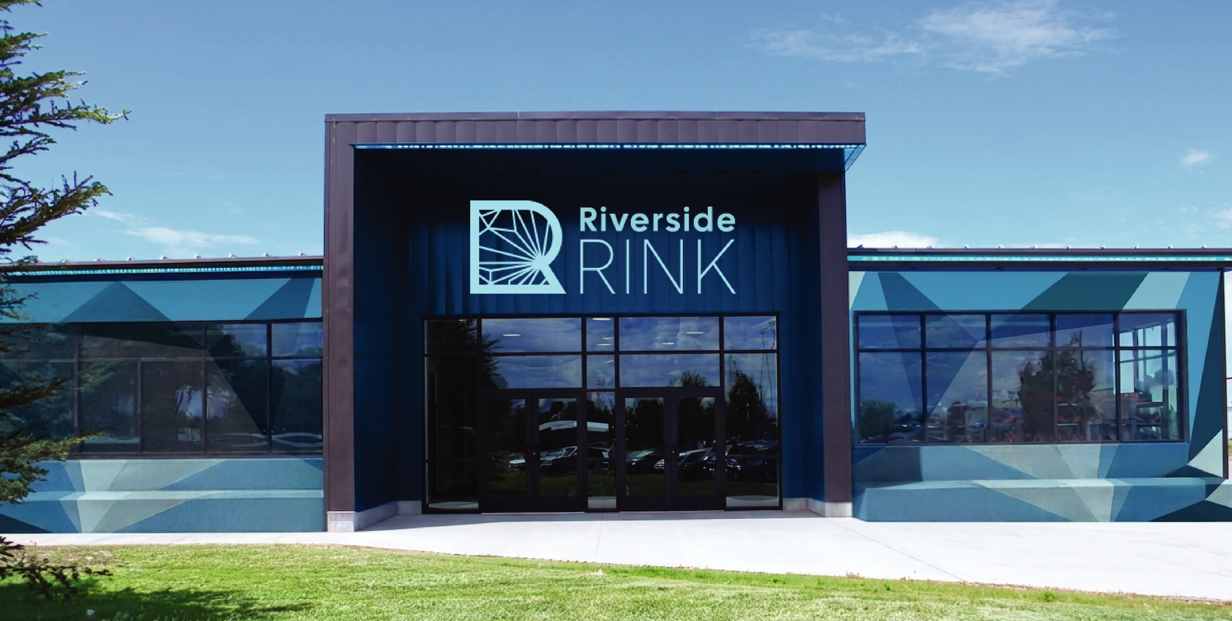
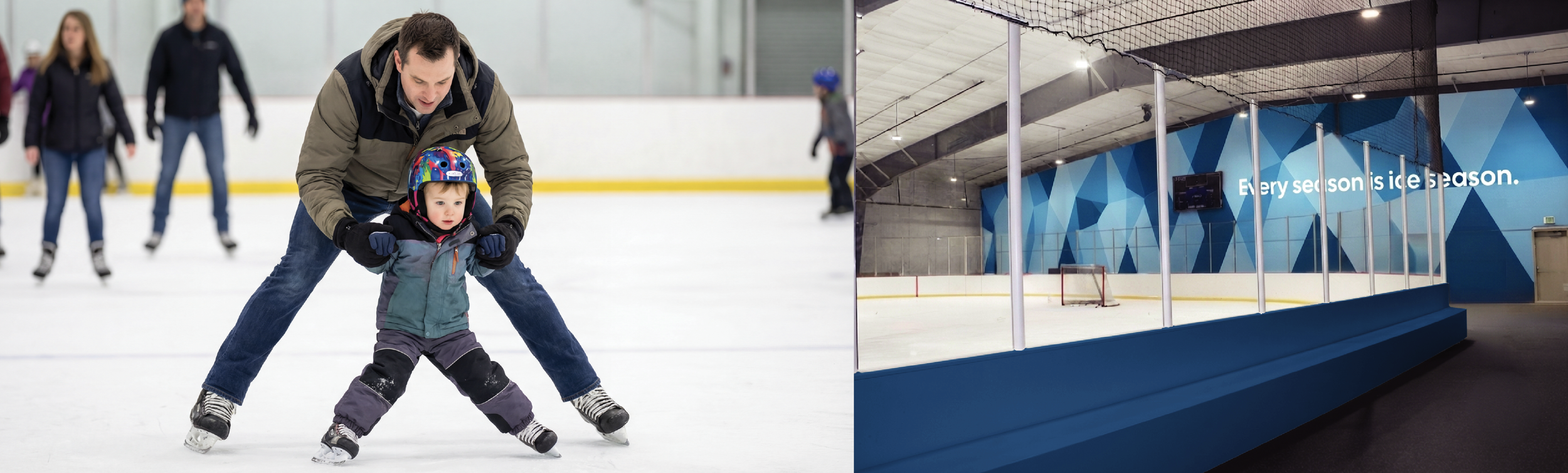
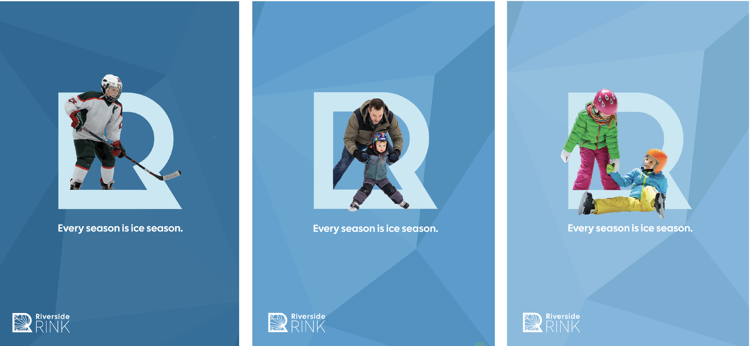
If Rexburg Rapids brought the sun, Riverside Rink brings the chill. It's polished enough for competitive skaters, yet friendly enough for a family just there to have fun.
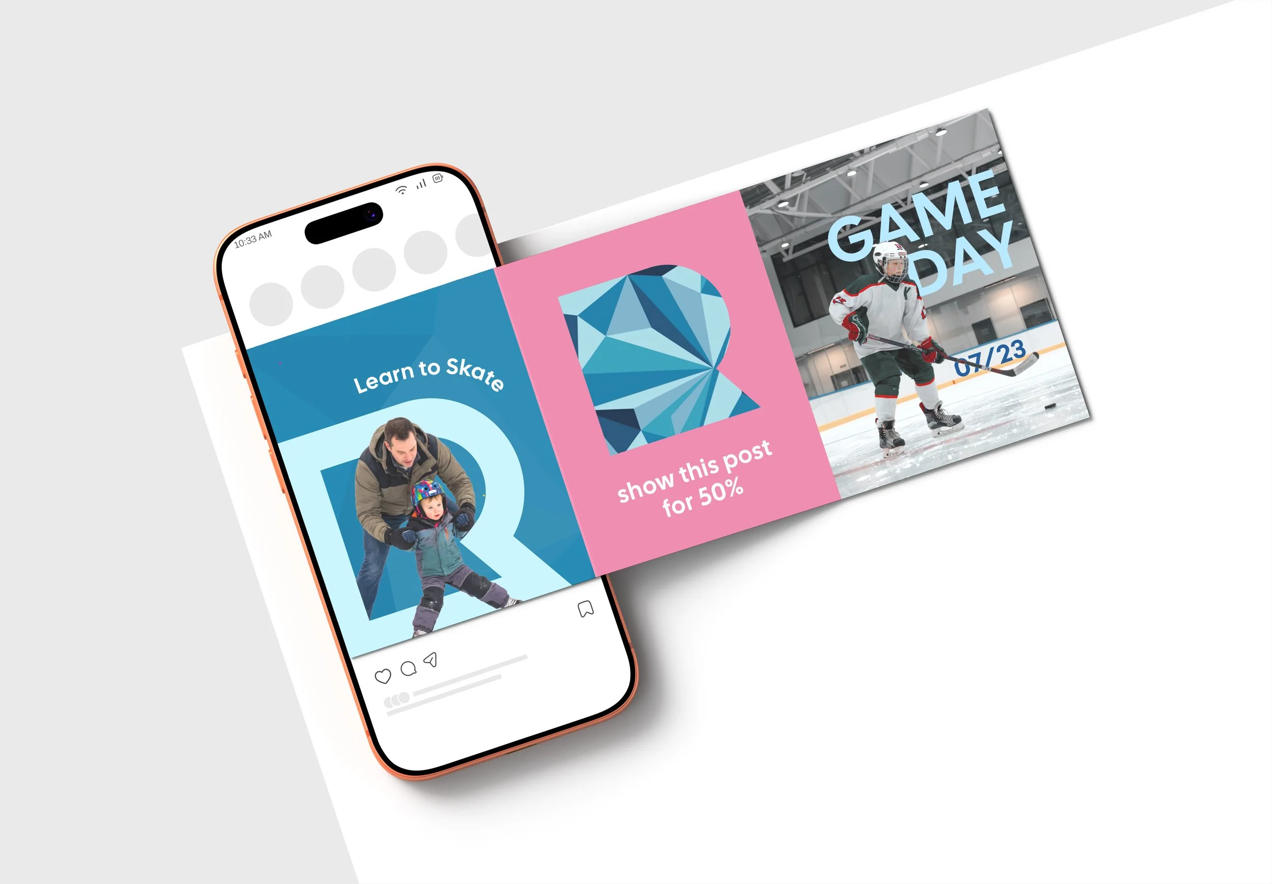
The bright colors and movement continue from print to on the screen. This system allows for freedom, flexibility, and experimentation.
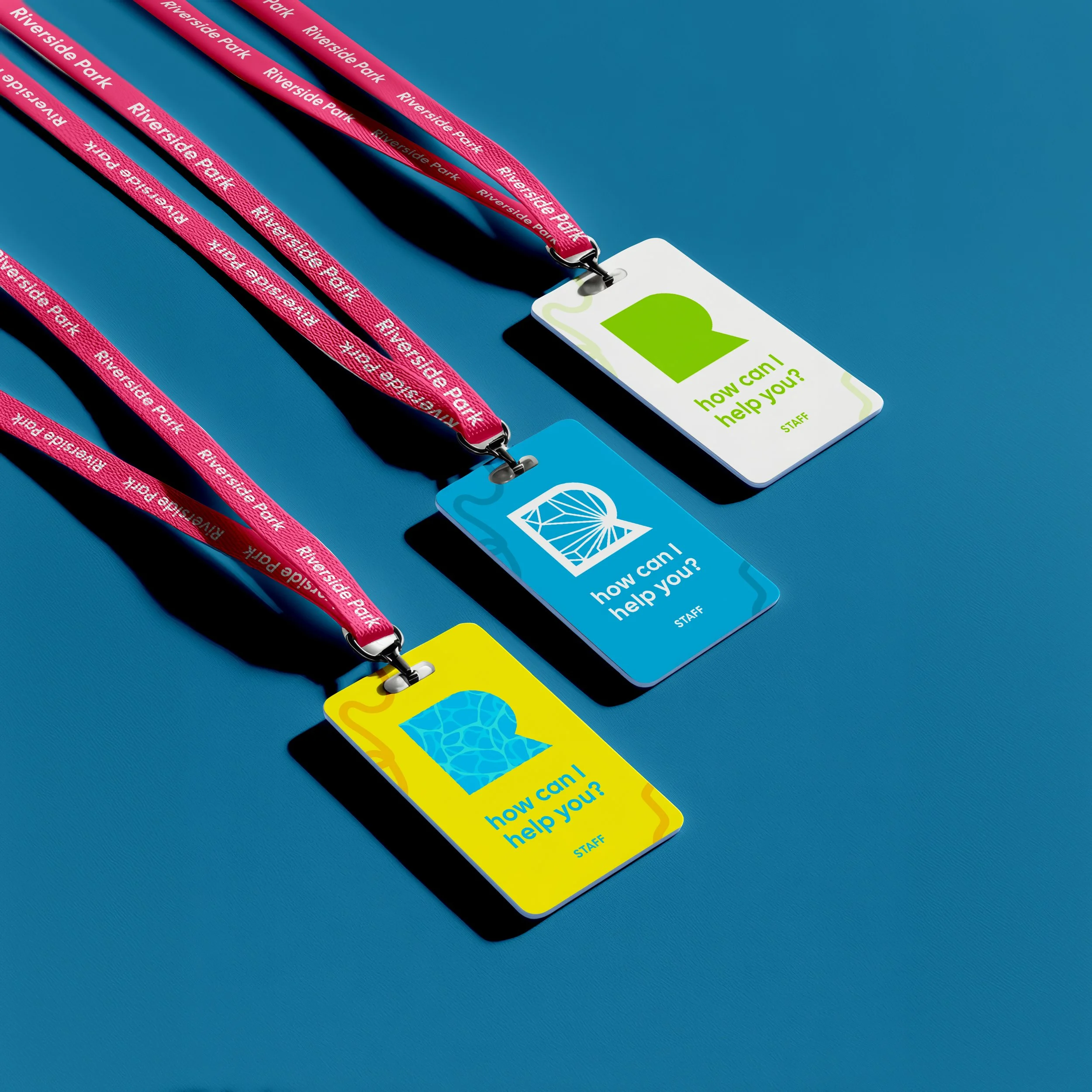
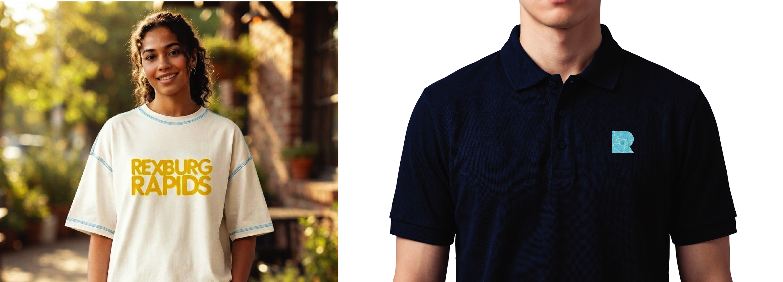
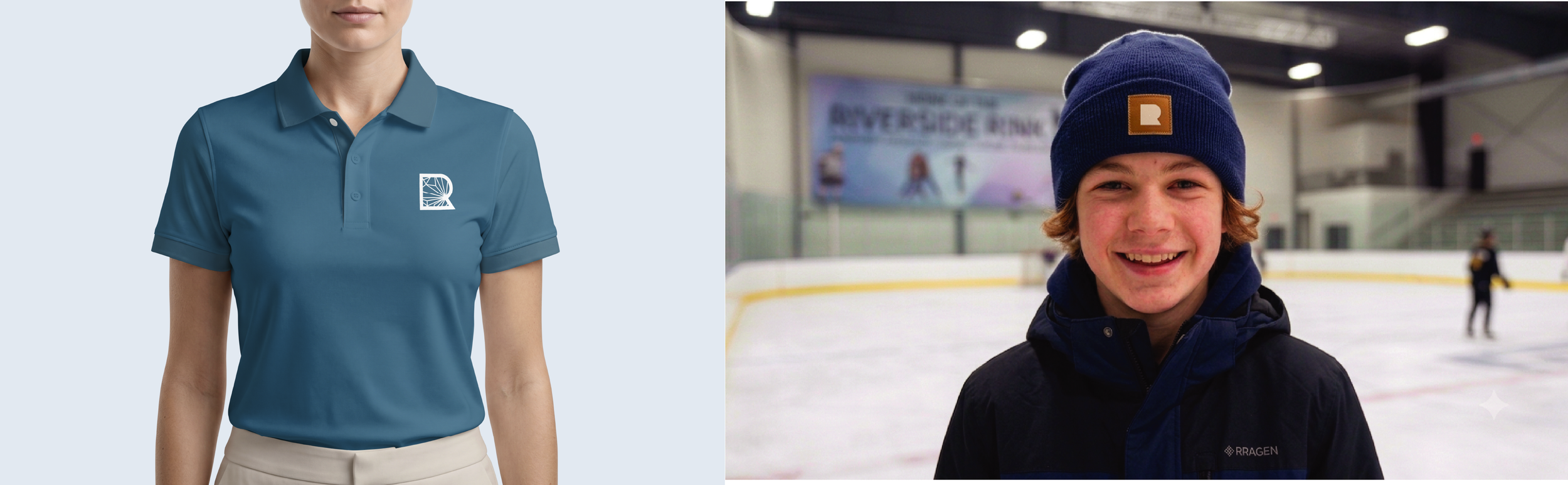
Staff attire emulates not only the vibrant colors, but the brands core attitudes. Riverside Park values safety and community.
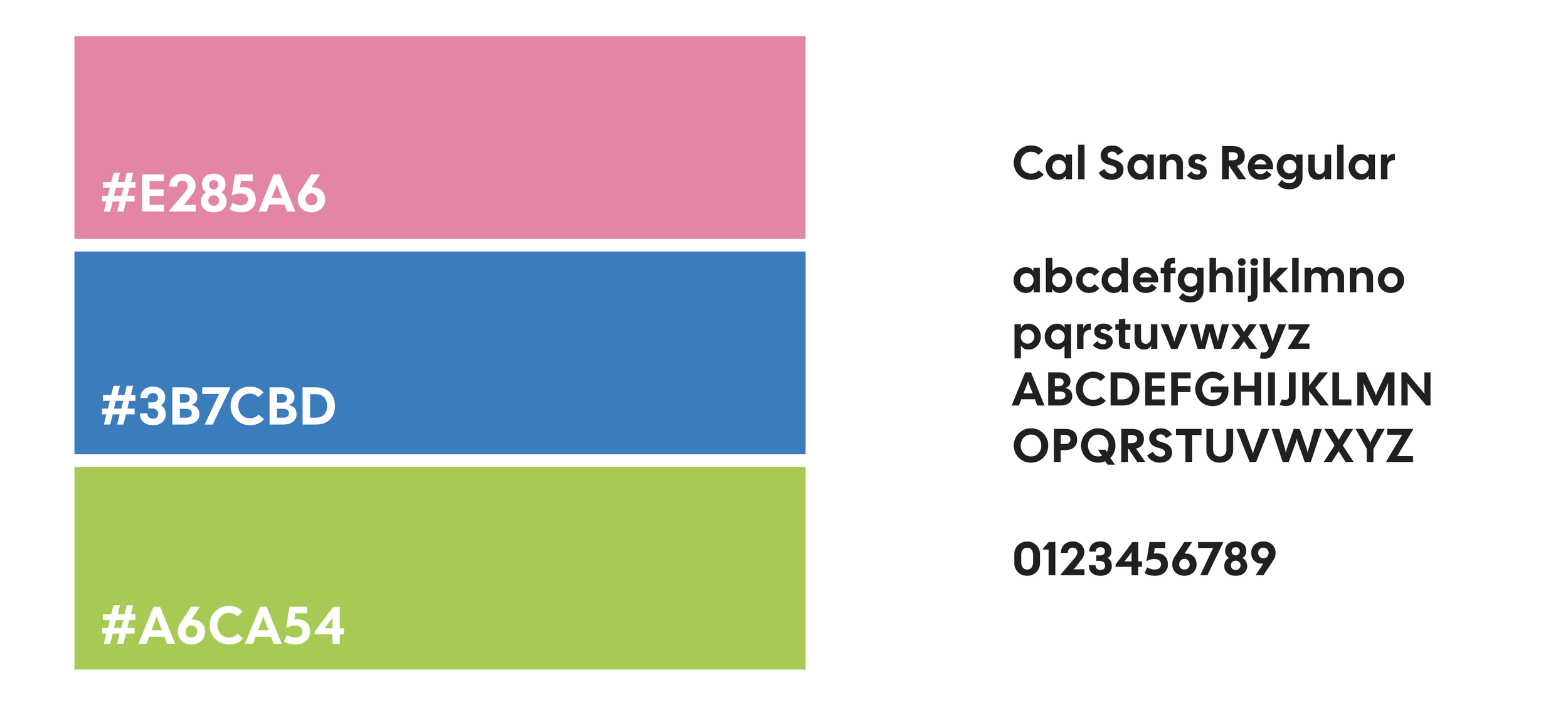
The font seen throughout is a friendly sans serif, easy to read and simple.
Colors are vibrant and also not limited to just this color palette. The brand is built to be whatever the community feels and wants it to be, whether its local art or current trends.