Simple. Italian. Refined.
Concept Design
Logo Design
Chiaro is a concept restaurant brand rooted in the idea that great Italian food doesn't need to be complicated. It just needs to be done well. The identity was built around restraint: a high-contrast serif wordmark with a custom olive oil drizzle submark woven into the letterform, a palette of black, warm white, and muted olive, and typography that feels elevated without being stiff. Every touchpoint, from the menu, business cards, staff apparel to website UI, was designed to live cohesively in the same world, telling the same story: simple, Italian, refined.
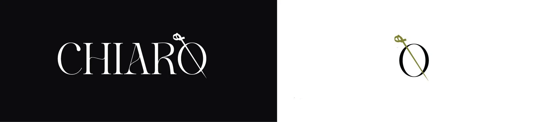
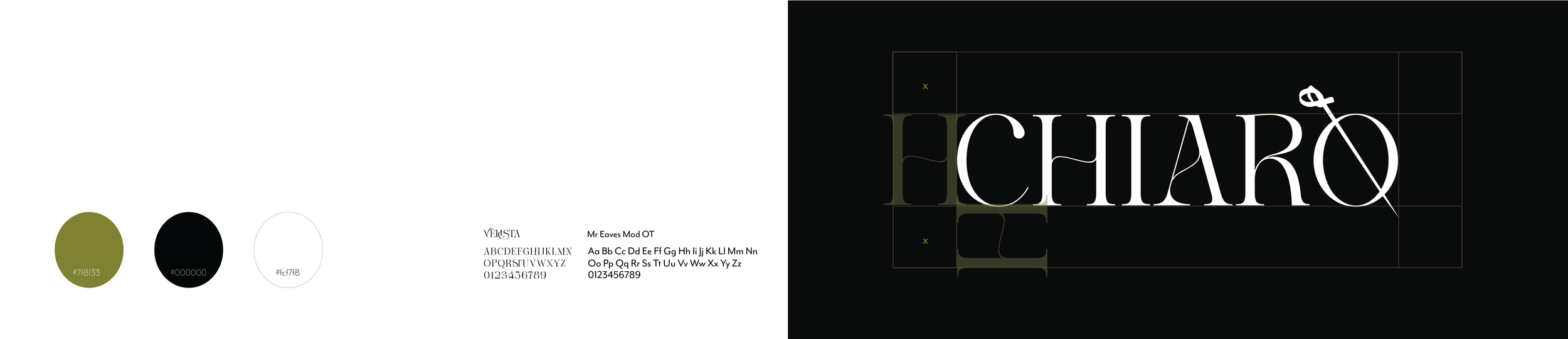
The Chiaro identity is built on three colors and two typefaces, nothing more. Verista drives the wordmark's editorial weight, while Mr Eaves Mod OT handles all supporting text with quiet legibility. The olive, black, and warm white palette keeps every touchpoint feeling intentional without feeling precious.
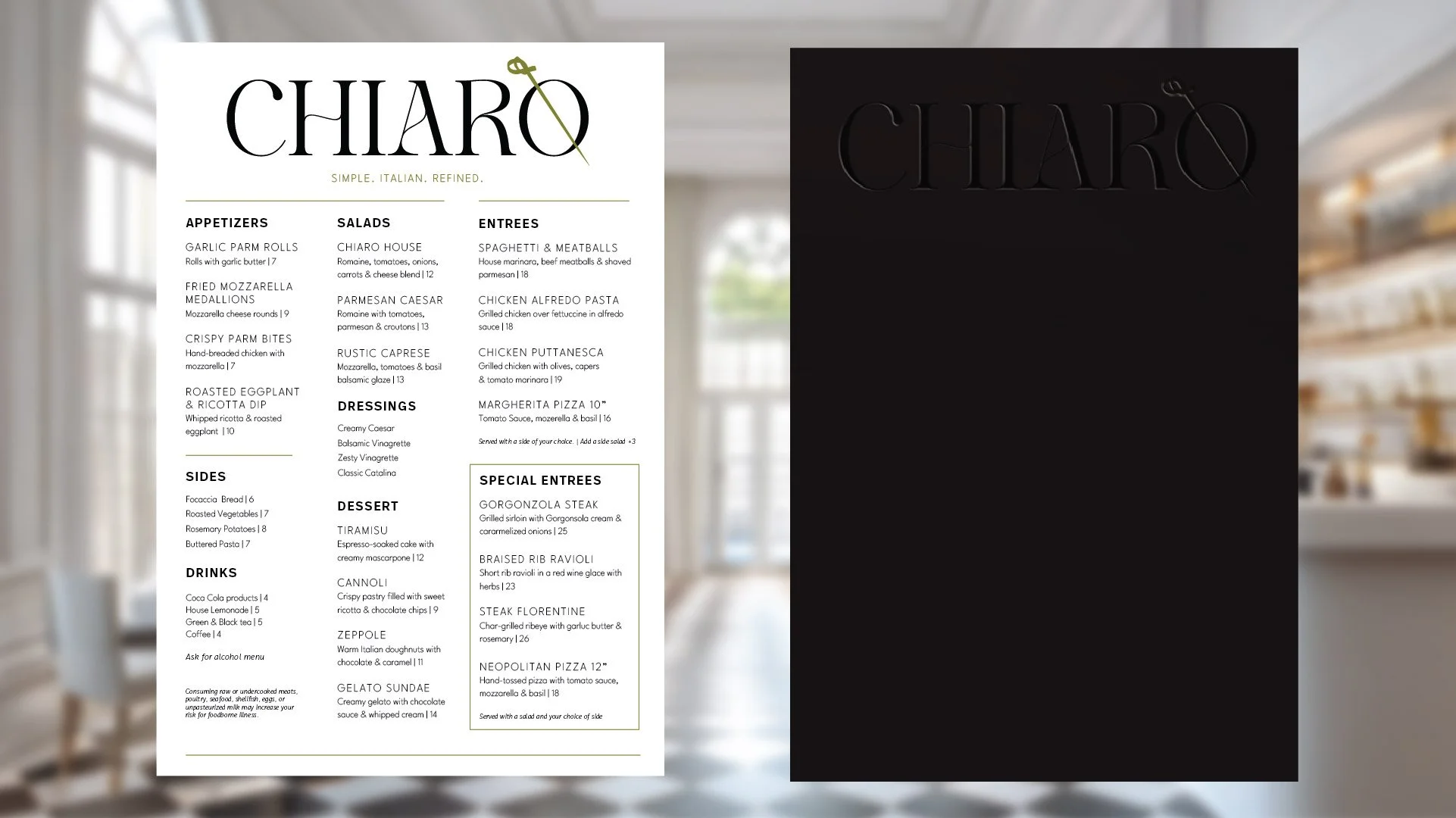
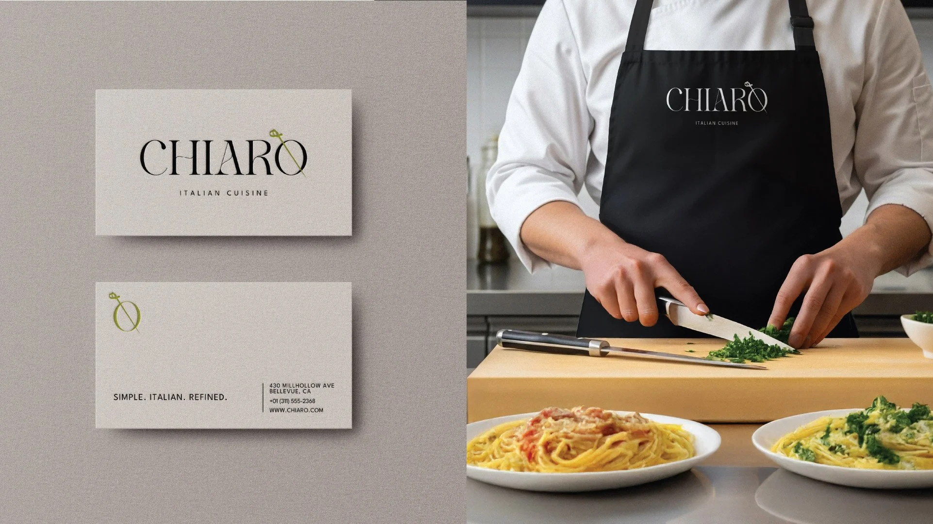
Chiaro was an exercise in discipline, proving that a strong brand identity doesn't need to be loud to be felt. Every decision, from the olive oil submark to the menu layout, was made in service of one idea: simple, Italian, refined.
“A strong brand identity doesn't need to be loud to be felt.”
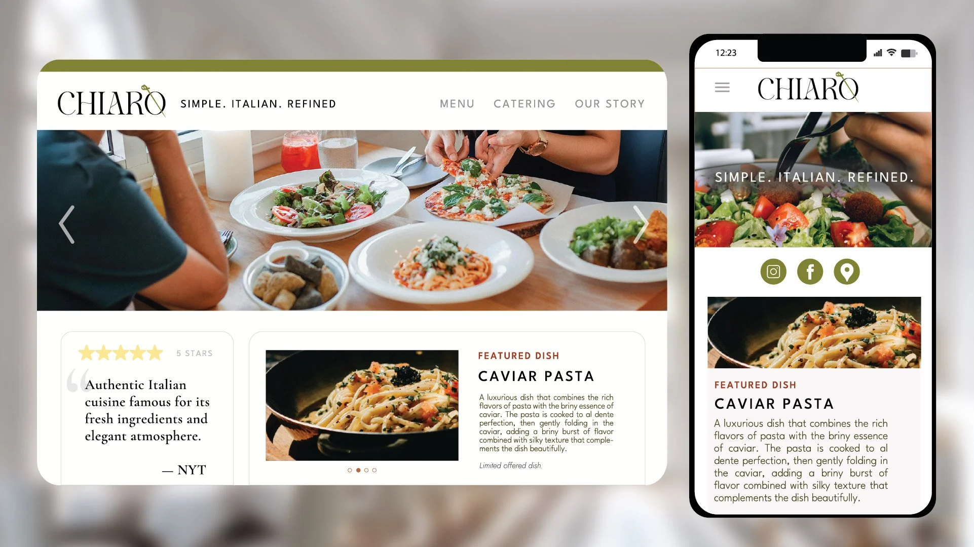
The brand identity extends into a responsive web UI designed for both desktop and mobile. The system translates cleanly across screen sizes. Same hierarchy, same restraint, same voice.