a brand worth highlighting
Concept Design
Branding & Packaging
Overview
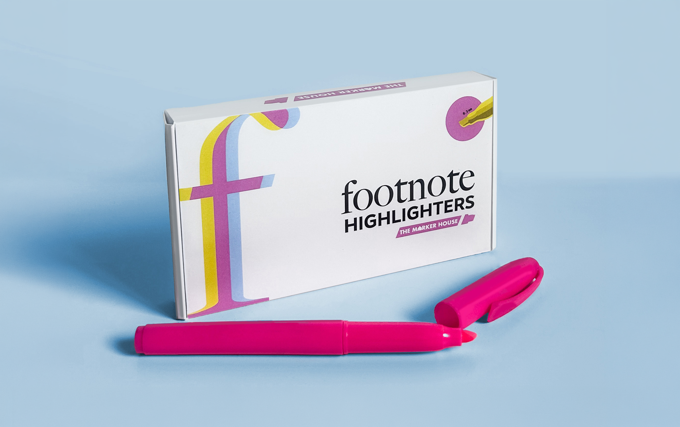
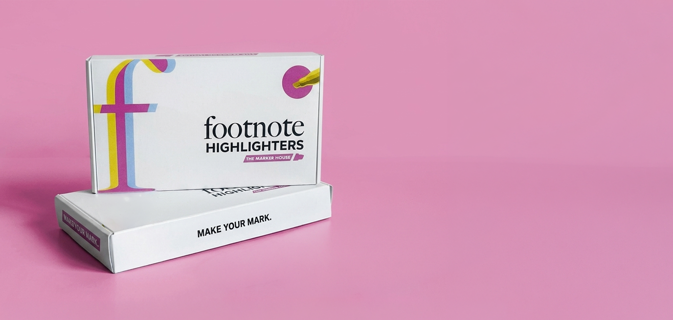
Footnote Highlighters is built for college students who want a modern, clean study experience. The identity focuses on simplicity and intention — minimal design paired with durable, long-lasting product quality that fits naturally into everyday student life.

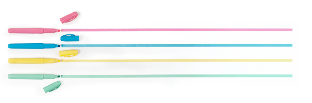
We embrace high-contrast, vivid color palettes that command attention, proving that minimalist design can still make a loud, confident statement.
vibrant contrast
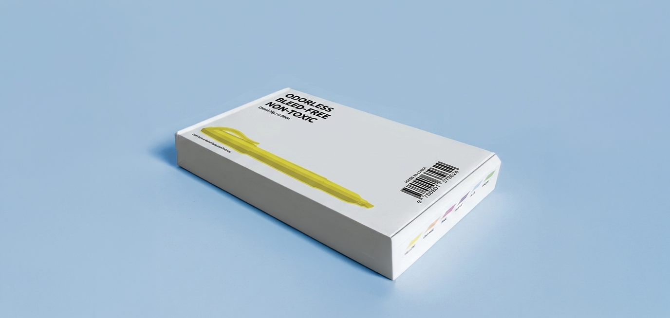
By stripping away logos and unnecessary bulk, we deliver a purposefully unbranded, ultra-clean aesthetic focused entirely on flawless functionality.
plain precision
transparent tactility
We celebrate the raw honesty of the creative process, connecting the physical sensation of ink on paper with the open blueprint of our design journey.
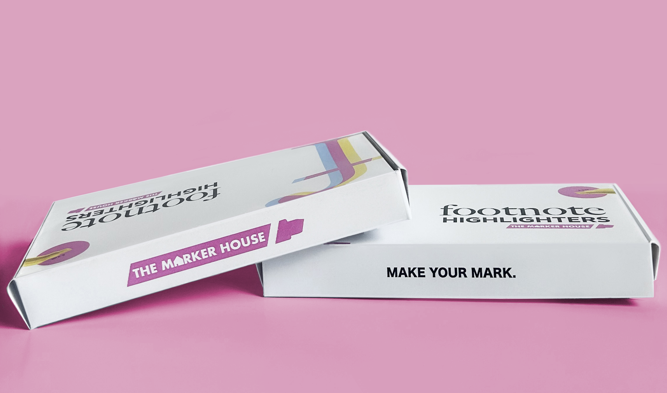
Logo design
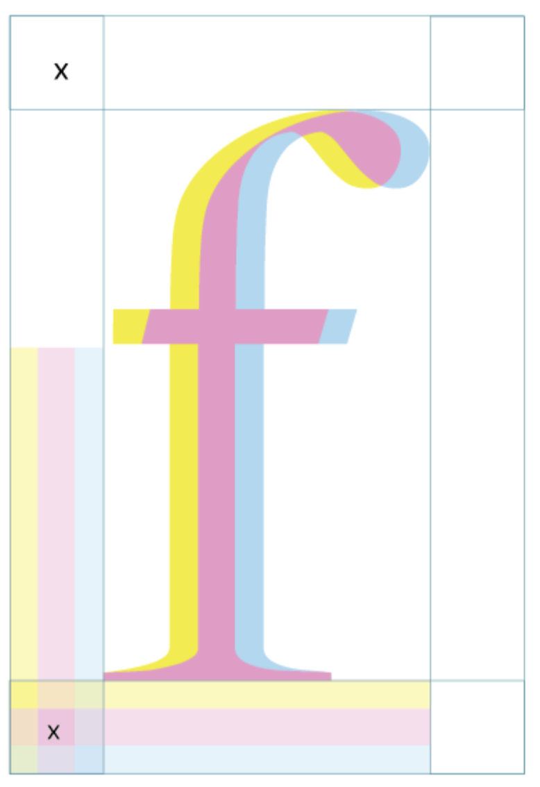
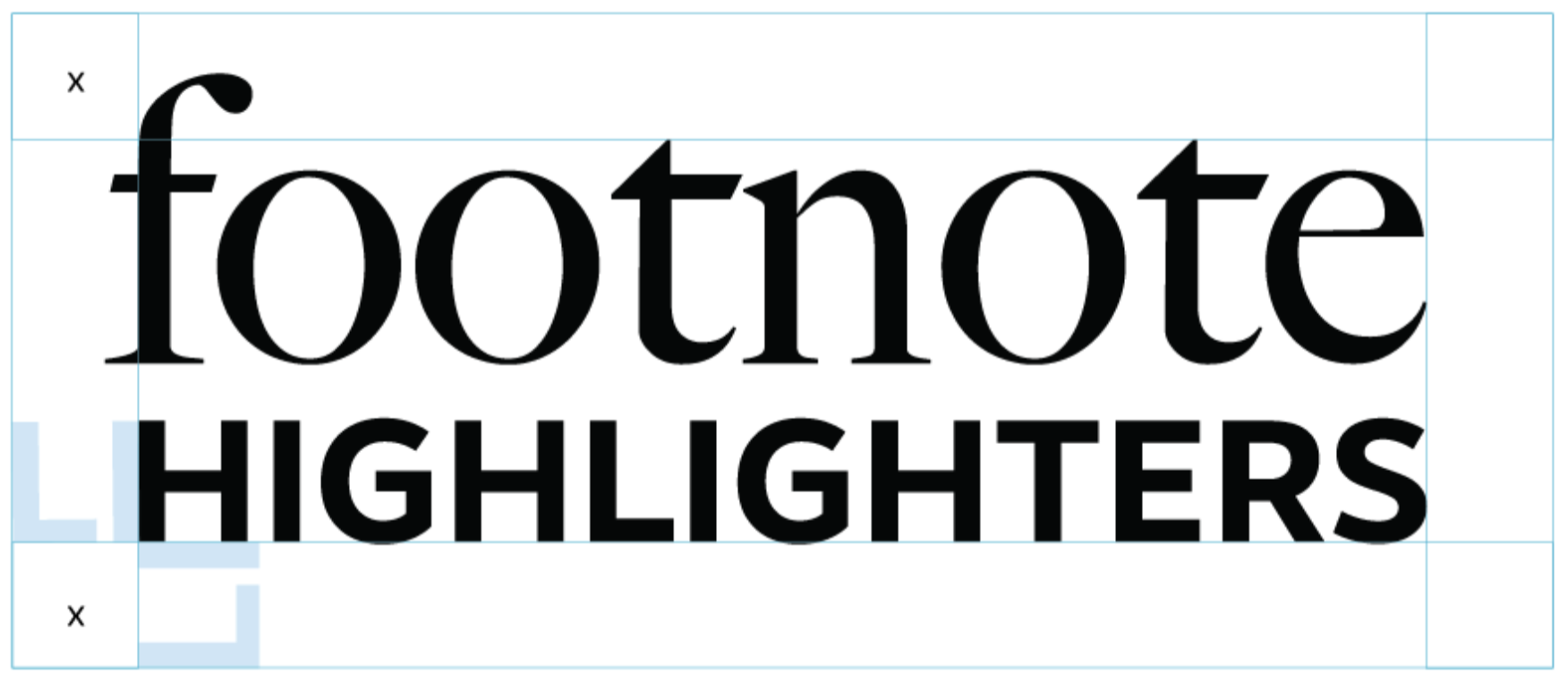
Built on a meticulous grid system, the layered monogram logo mirrors the strategic geometry of the tools themselves, blending strict precision with clean, minimalist design.
Color & typography
The identity merges Plain Precision with Vibrant Contrast by pairing an editorial serif typeface with a gridded geometric sans-serif. This disciplined layout is energized by a vivid Cyan, Magenta, and Yellow palette that honors traditional print ink, creating a striking visual statement without unnecessary distraction.

#95d4ef
#ea9ec4
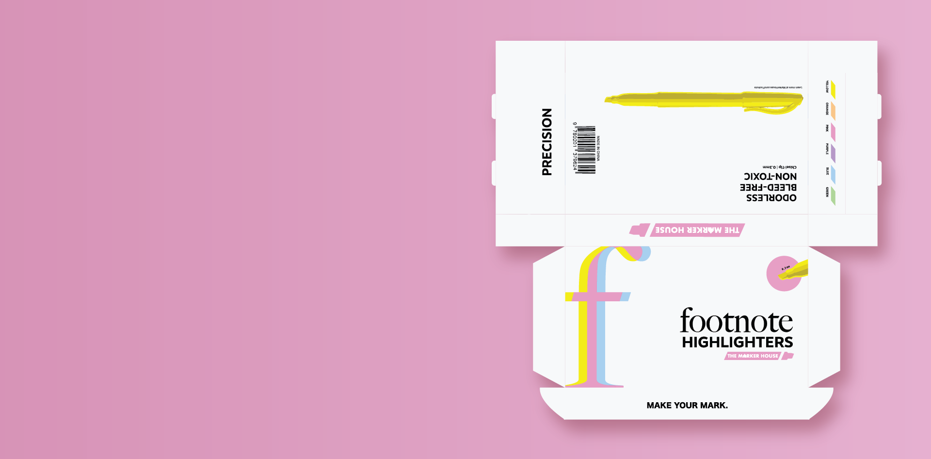
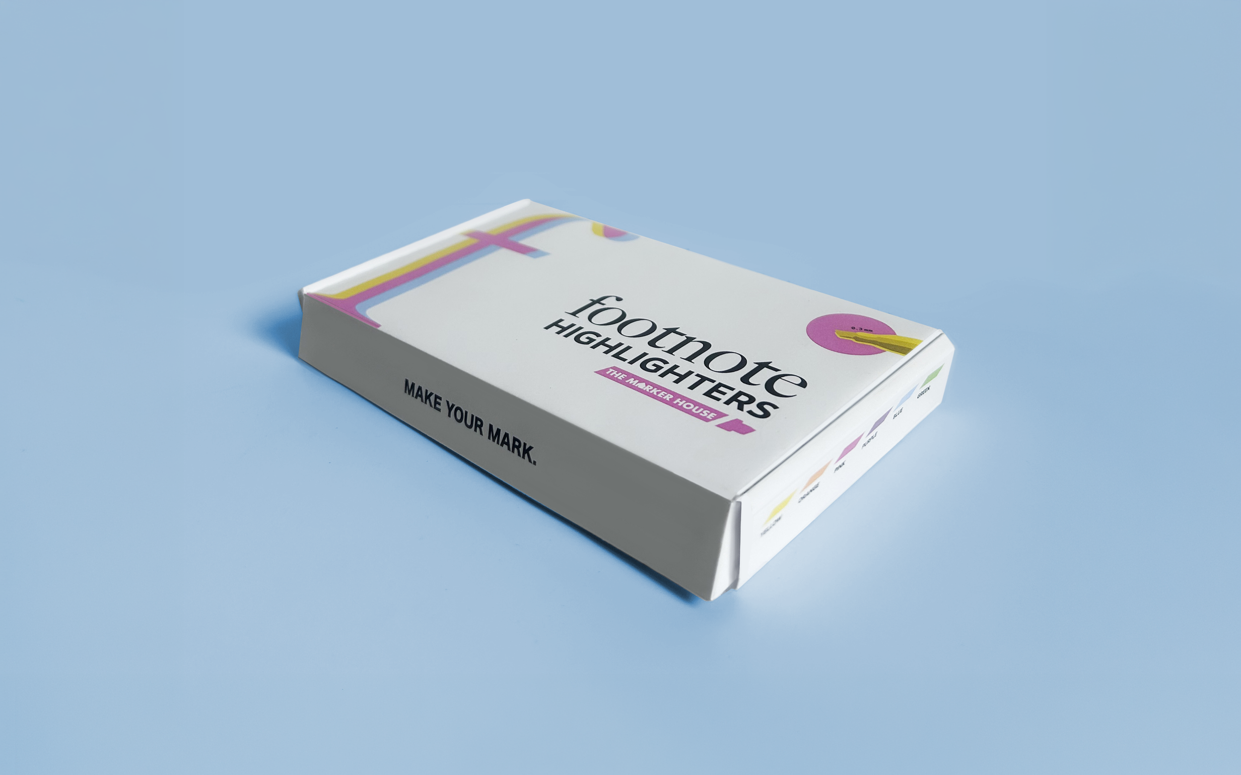
Grounded in Transparent Tactility, this flat layout exposes the foundational design structure behind our physical packaging. The design balances a stark, unbranded white canvas with strategic color callouts to ensure both high-end utility and immediate brand recognition.
Dieline